With great pride, DynaChain unveils a new chapter in its visual identity, fitting for the dynamic and rapidly changing world of cryptocurrency, where community engagement and innovation meet.
A vibrant new logo representing expansion, connectivity, and success has been unveiled as part of this rebranding initiative. This rebranding effort, which includes a redesigned website, is an expression of DynaChain’s dedication to staying ahead of the curve and its hopes for the future of blockchain technology.
Design Objectives: Fostering Global Connectivity in Health-Fi
An adaptable visual asset that can break down geographical barriers was the primary goal of this rebranding effort, especially in the rapidly growing health-fi industry. The objective was to create a sign that represents DynaChain’s growth while simultaneously bringing people together from all over the globe.

Design Philosophy: Exclusivity for DC Plus Holders
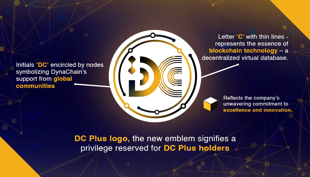
Drawing inspiration from the design elements of the DC Plus logo, the new emblem signifies a privilege reserved for DC Plus holders. It serves as an invitation to embark on DynaChain’s growth journey, promising a future imbued with happiness and prosperity for those who join the endeavor.
Design Elements: Nodes, Circles, and Thin Lines
Central to the design is the incorporation of the initials ‘DC’ encircled by nodes, symbolizing DynaChain’s support from global communities. The inclusion of a thin line within the letter ‘C’ represents the essence of blockchain technology – a decentralized virtual database. This line acts as the bridge between the visualization of blockchain and the interconnected nodes, each representing boundless possibilities.

Target Audience: Aspiring for Health and Prosperity
The newly crafted logo resonates with a community aspiring for both health and prosperity, aligning seamlessly with DynaChain’s dedication to promoting wellness alongside financial incentives.
Image Communication: Embracing Future Trends
The design communicates DynaChain’s commitment to navigating the evolving trends of the future, symbolizing the limitless growth potential within the blockchain space.
Style and Sense: Elegance in Black, Gold, and White
DynaChain’s reimagined logo features a sophisticated color scheme of black, gold, and white, projecting a professional, high-end, and technologically advanced image. This choice reflects the company’s unwavering commitment to excellence and innovation.
Design Process: Iterative Excellence
Throughout the design journey, multiple feedback sessions and revisions were conducted to ensure that the final emblem aligns seamlessly with DynaChain’s brand vision and meets the dynamic demands of the market.
The Final Result: A Distinctive Identity
The culmination of these efforts yields a distinctive and captivating logo for DynaChain. Beyond enhancing brand recognition, it reaffirms the company’s position and credibility in the cryptocurrency landscape. As this emblem is unveiled, stakeholders are invited to explore the boundless opportunities that lie ahead on the DynaChain journey.
In embracing this new visual identity, DynaChain eagerly anticipates a future where connectivity, innovation, and prosperity converge within its vibrant community. Welcome to evolution. 🌐✨


